You’ve noticed something different at RunWaterloo this June. We teased you with a new slogan at kit pickup on Saturday, new signage at the event on Sunday, and new logos on some online properties today. What gives?
We’re excited to officially release a RunWaterloo rebrand, including a new focus on our Classic event(s), a new slogan, and several new logos to reinforce this new direction.

Run Classic
The races that we are best-known for – with the largest crowds, fastest fields, and deepest histories – are the Waterloo 10 KM Classic and the Oktoberfest Run. They are the two oldest running events under the RunWaterloo umbrella, and they are our twin focuses going forward.
To match this commitment, we are doing two things: raising the profile of the Waterloo 10 KM Classic to its proper place as our flagship event. You will see this over the next year, as we celebrate the race’s 40th year in advance of its 40th running in 2017.
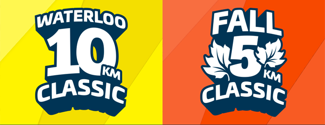
Second, we are increasing the profile of the Oktoberfest Run to share this “classic” brand. So much so, that we are actually rebranding this event as the Fall 5 KM Classic. This event truly is a fall classic, and this new name reflects that.
New slogan
What do we do? In one succinct, four-word phrase, we are:
Inspiring community through running.
Runners are an incredibly inspirational bunch, and we learn a lot from you. RunWaterloo is by runners, for runners, and we are energized every day by the individuals that make up our running community. So whether it’s inspiring people to start running, inspiring people to choose and achieve goals, or using running to inspire other aspects of community – such as charity and volunteerism – we are happy to be inspiring community through running.

New logos
As you’ve noticed, we are supporting changes through a new system of logos and colours.
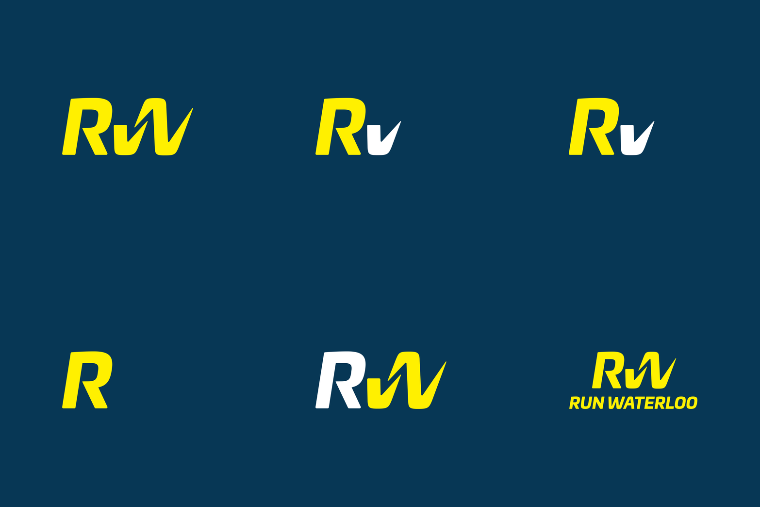
Our previous RunWaterloo logo was introduced in August 2012. We still like the “running W” or “running man,” and you will continue to see it in The Runway logo, but compare the “running W” to our new logo:
Matthew Aubie, Principal & Creative Director at Aubs & Mugg Inc., designed this logo, and has this to say about it:
The new identity takes a consciously more athletic approach. The goal of the new identity is to allow Run Waterloo to stand next to major sponsors and well-known running associations. The RW acts not only as the brand name’s initials, but also as a call to action with the hidden RUN formed in the letters.
Did you see the hidden RUN?
Additionally, we have refreshed our Waterloo 10 KM Classic logo. The original was hand-drawn in 1979, and it has served us well since then. The updated version is a refined and modern take, which is consistent with our new overall brand. Of course, we are also debuting a new logo for the Fall 5 KM Classic!
More about Aubs & Mugg
Aubs & Mugg is a multi-disciplinary design firm based in Toronto and Ottawa. A look at their portfolio shows their passion and expertise for empowering brands. This entire rebrand of RunWaterloo is just the latest example, and we’re super excited to be working with them. Aubs & Mugg has joined RunWaterloo as a gold sponsor in 2016.


5 Comments
i think its great and makes sense. as a runner for 33 years inspiring your community though running helps. as I said yesterday your crew and the races you have are great. I have done other races with different crews and yours still stands out for me. everything is so organized its amazing. again to you and your crew well done.
Thanks, Robert, for your support. Our ‘by runners, for runners’ attitude is genuine and we’re glad you appreciate it.
Looks Great Jordan!!
Thanks Erin! It’s a whole team effort 🙂
Comments are closed.